Gauteng’s ward level racial diversity: 2018
-
Samy Katumba
- Date of publication: 28 February 2019
- Download map

This map of the month provides three different ways of depicting racial integration in Gauteng: maps of levels of racial diversity in each ward; binary maps distinguishing wards with high diversity and low diversity; and a case study showing ward level changes.
Figure 1 provides a 2018 map of racial diversity per ward in order to update the map based on 2011 data published in September 2017. As in that map we compute the level of racial diversity or integration per ward using an entropy index. The entropy index is lower if one race dominates the ward (lighter shading) and higher if the proportion of races in the ward are more equal (darker shading). In order to compare over time, the figure 1 is presented as a slide show to reveal the shifts between 1996, 2001, 2011 and 2018. The individual maps are available at the end of the article.
Overall, the patterns of racial integration across Gauteng have remained similar from 1996 to 2018, as depicted in the map series. Wards located in old township areas and on the periphery of the province display low levels of racial integration, while wards located in the core are characterised by high levels of racial integration. By comparison, wards located in the central parts of Tshwane (e.g. areas around Pretoria) and in the northern suburbs of Johannesburg (e.g. Sandton, Randburg) have become more racially integrated over the 22 years period. Amidst this notable change, the range of variation of diversity index scores has remained the same with very marginal differences in the maximum diversity index scores for each of the considered years (i.e. 1996, 2001, 2011 and 2018). As the exercise later in this article shows, this apparent continuity over time obscures a considerable degree of change at ward level. Thus, a similar entropy index over time can result from entirely different population compositions of the ward.
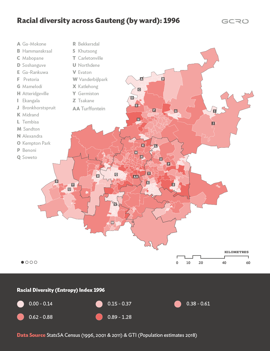
Figure 1. Slide show of maps showing the level of racial diversity within each ward for 1996, 2001, 2011 and 2011. (Component maps are available as static images in appendix 1).
Figure 2 offers a binary mapping over time, simply distinguishing wards with low racial diversity and wards with high racial diversity. These maps were generated using a machine learning analysis (K-means cluster algorithm) to classify each ward. The results obtained are illustrated in a series of binary maps that only display wards categorised as having high levels of racial diversity in pink (i.e. clustering of wards with high values of the index racial diversity) or low levels of racial diversity in blue (i.e. clustering of wards with low values of the index racial diversity). Once again, clusters of wards located at the periphery, around areas such as Soshanguve, Mabopane, Mamelodi in Tshwane, Tembisa, Katlehong and Tsakane in Ekurhuleni, and Soweto, Alexandra and Diepsloot in Johannesburg, exhibit low levels of racial integration. This observed pattern has been sustained over the four time periods (i.e. 1996, 2001, 2011 and 2018). Over time, some of these patches of clusters have increased in sizes (e.g. areas around Hammanskraal, Pretoria and Mamelodi in Tshwane). Such changes could be attributed to the rapid increase of one population group (i.e. the African population) that dominates the rest within a given ward. Instances of mobility of a given population group to well-off wards could also be plausible.
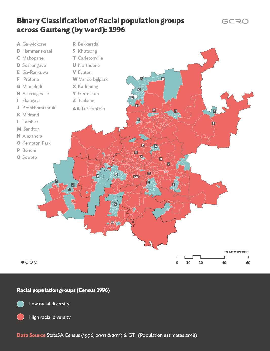
Figure 2: Binary classification of each ward as either low or high racial diversity: 1996, 2001, 2011, 2018 (Component maps are available as static images in appendix 2)
Finally, we consider some dynamics that are not evident in these maps by considering the changing racial composition of a particular site – namely two wards (i.e. ward 55 and ward 124 in Johannesburg) around Turffontein. As can be observed in Figure 3, the Black/African population has significantly increased over the years (from 1996 to 2018) while the white population has moved from being the majority to a minority. Although the proportion of Africans and whites has reversed (i.e. from 30% to 65% for black and from 55% to 11% for white) between 1996 and 2018, the index of racial diversity has remained the same.

Figure 3: The racial composition of Turffontein (Wards 55 and 124) (Data source: StatsSA Census (1996, 2001, 2011) & GTI (2018))
These observed changes in the racial composition of the two wards are not evident when mapping the index of racial diversity at the ward level for the entire province as illustrated in the map series above. For example, one can see areas where the levels of racial segregation have subsided or areas where the levels of racial segregation have remained unchanged. However, a more granular investigation of racial diversity reveals some dynamism in terms of the racial composition of certain wards over time regardless of whether the levels of racial segregation have decreased or not. This is a limitation of the entropy index in terms of capturing variations in the racial composition of neighbourhoods over time.
Data note:
The 2018 maps and calculations were based on modelling work conducted by GTI. When investigating individual wards (Figure 3), we found that some wards did not have populations in 2018 that seemed reasonable given the 2011 data (they had lost thousands of people where we expected growth). We therefore note the need for investigating these inconsistencies further.
Appendix 1: Component maps of Figure 1


Appendix 2: Component maps of Figure 2


Edits and comments by: Richard Ballard and Graeme Götz